
Turning to spring-like thoughts, the PCAGOE challenge theme for April 2016 is "flowers". To be sure, there are so many flowers that I love, hydrangeas, dogwood blooms, tulips, dahlias... the list could go on, seemingly ad infinitum. There is one frilly face that I especially look forward to seeing in the late spring/early summer days, that of the poppy. I don't have any of these lovelies in my own garden, but a neighbor's house across the street has them, and I am a yearly admirer. I also love the symbolism of using poppies to remember the deceased. It was this time last year when my neighbor with the poppies in her garden passed away. She was a friendly soul, who enjoyed sitting on her porch in the morning. We'd often had a chat standing in that garden of hers as she caught me enroute to or from my morning walk. So, with these things in mind, I decided upon the subject of poppies for my challenge project.
One of the things that draws me to these flowers, and which I had hoped to translate in my piece, is the translucency of the petals.
When the subject was settled, I decided that I wanted to make this into a neck piece. The style of this piece was to be influenced by the work of a favorite ceramic artist, Carol Long Pottery. These two following pieces of Carol Long greatly influenced my neck piece, and they are some of my most favorite works by her:


I love the flowing lines, curvy shapes, the Art Nouveau feel, the pearly dots, Carol's work strikes a chord with my personal aesthetic. If you haven't heard of her before, please do check out her many other pieces at her website or on her facebook page.
So, with all these things in mind, I set to work sketching out a plan. I came up with a necklace design that I thought would fit my vision.

I decided that I wanted an asymmetrical design, that would not incorporate a clasp, i.e. it would wrap around the neck. For this, I decided that it would be built upon wire. My first step was to cut a piece of wire for the base and curve it into the basic shape which I envisioned for the neck piece (above).
Next up came extruding a hollow core tube of polymer, which would cover the wire.

Here you can see the extruded hollow tube. Brief plug for Lucy Clay tools: I love my Lucy Clay Czextruder, extruding is a breeze with this tool!
For the clay, I decided to use a blend of (mostly) Sculpey Souffle in the pistachio green color, with a bit of Premo light green pearl and some Premo translucent added to the mix. I've read that Souffle is strong but more flexible. Because the neck piece is designed to bend and wrap around the neck, the most strong yet flexible clay was desirable. It was not super easy to get the tubing to slide over the entire length of the wire, so I gave a coating of cornstarch to the wire and then it slid on easier. Because of the length, I had to approach the wire from both ends with the tubing and then join the two sides in the center. While this piece cured, I set to work on creating the poppies. I made 3 opened flowers, one upturned (side view) flower and two buds opening. For the petals, I chose to use Pardo translucent (because it is known to be the most translucent of all the brands) mixed with some mountain rose and watermelon colored Adirondak alcohol inks.

I cut the sheeted polymer with a round cutter and then I placed it between crepe paper (to mimic the veining of flower petals) and rolled it through the pasta machine. Above you can see the before disc laying on the red crepe paper, and the after flower petals laying to the left side of the crepe paper. Though these were quite thin, I still wanted the edges tapered as finely as possible, so I used my fingers to thin out the edges. For the bases of the flowers, I used a piece of wire which I had curled a loop onto the end (the loop ensures that the wire doesn't just slip out of the clay). I built up the center using the same green mix from the stem necklace base, then a disc of black, which I embossed with a starburst pattern. This starburst was then brushed with green/gold mica powder. A larger disc of black was placed on the wire to cup the center. This black disc was cut with a scissors to create the stamens of the poppy. Then, finally the petals were attached. After they were cured, I added a touch more of the watermelon red Adirondak ink, to the petals, to bring out the veining that the crepe paper imprinted onto the clay.

I wrapped the wire ends of the flowers around the previously cured necklace base. After this point, I was so enraptured with creating that I failed to take any further "in process" shots. After all of the flowers were mounted on the green base, it was time to make the intertwining vine. I wanted to mimic Carol Long's black flowing lines. So I took another piece of wire and extruded a hollow tube of Souffle black. This polymer tube, however, was a bit off center. So, I decided to give a twist to the polymer after it was on the wire, this would give strength to the thin areas. I think it was meant to be this way, because I like the fact that it looks more like a twig with this twist in the clay. After curing, I molded the black vine around the green base and the mounted flowers. At this point, I discovered that the flowers were too heavy for the necklace to keep it's desired shape around the neck. So I decided to reinforce the entire piece with a heavier gauge copper wire, and the back of the necklace was fully covered in black Souffle. The final design elements (also echoing Carol Long's style) were added by shaping some pearly dots and placing them sporadically around the perimeter of the piece. These were made with a Premo blend and a dusting of micro pearl mica. After the final cure, I was delighted with the design. Though not strictly adherent to my sketch, it's fairly close to my original vision.


I was especially pleased with the translucency of the flower petals, here's a detail shot of one of the poppy flowers:


A pleasant surprise was finding that I could twist the ends upon themselves for an alternative way to wear the neck piece, as seen below:

I also recently found out (after I had planned out the entire piece), in Christian symbolism, the poppy is seen as a metaphor - the red petals of the poppy symbolize the blood of a sacrificed Christ in the theme of resurrection and immortality. How perfect for a piece that is due to be unveiled to the world on Good Friday, and Easter weekend!
So, what's your opinion of my poppy neck piece? Do you have a favorite flower, or many favorite flowers? Does symbolism play a part in your choice of a favorite bloom? I'd love to hear your thoughts, so please consider leaving me a comment! ...and to those who celebrate this holiday, a Blessed Easter to you!
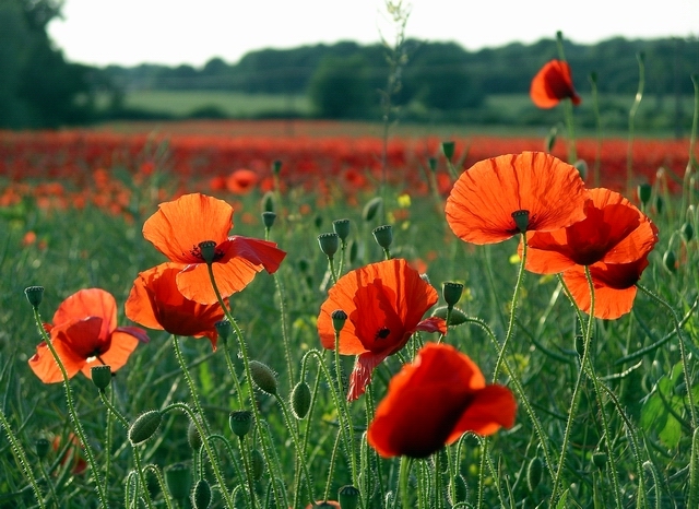 |
| This is not my original photo, it was taken from the web. Image © Copyright Lynne Kirton View image at: http://www.geograph.org.uk/photo/847625 |
When the subject was settled, I decided that I wanted to make this into a neck piece. The style of this piece was to be influenced by the work of a favorite ceramic artist, Carol Long Pottery. These two following pieces of Carol Long greatly influenced my neck piece, and they are some of my most favorite works by her:


I love the flowing lines, curvy shapes, the Art Nouveau feel, the pearly dots, Carol's work strikes a chord with my personal aesthetic. If you haven't heard of her before, please do check out her many other pieces at her website or on her facebook page.
So, with all these things in mind, I set to work sketching out a plan. I came up with a necklace design that I thought would fit my vision.

I decided that I wanted an asymmetrical design, that would not incorporate a clasp, i.e. it would wrap around the neck. For this, I decided that it would be built upon wire. My first step was to cut a piece of wire for the base and curve it into the basic shape which I envisioned for the neck piece (above).
Next up came extruding a hollow core tube of polymer, which would cover the wire.

Here you can see the extruded hollow tube. Brief plug for Lucy Clay tools: I love my Lucy Clay Czextruder, extruding is a breeze with this tool!
For the clay, I decided to use a blend of (mostly) Sculpey Souffle in the pistachio green color, with a bit of Premo light green pearl and some Premo translucent added to the mix. I've read that Souffle is strong but more flexible. Because the neck piece is designed to bend and wrap around the neck, the most strong yet flexible clay was desirable. It was not super easy to get the tubing to slide over the entire length of the wire, so I gave a coating of cornstarch to the wire and then it slid on easier. Because of the length, I had to approach the wire from both ends with the tubing and then join the two sides in the center. While this piece cured, I set to work on creating the poppies. I made 3 opened flowers, one upturned (side view) flower and two buds opening. For the petals, I chose to use Pardo translucent (because it is known to be the most translucent of all the brands) mixed with some mountain rose and watermelon colored Adirondak alcohol inks.

I cut the sheeted polymer with a round cutter and then I placed it between crepe paper (to mimic the veining of flower petals) and rolled it through the pasta machine. Above you can see the before disc laying on the red crepe paper, and the after flower petals laying to the left side of the crepe paper. Though these were quite thin, I still wanted the edges tapered as finely as possible, so I used my fingers to thin out the edges. For the bases of the flowers, I used a piece of wire which I had curled a loop onto the end (the loop ensures that the wire doesn't just slip out of the clay). I built up the center using the same green mix from the stem necklace base, then a disc of black, which I embossed with a starburst pattern. This starburst was then brushed with green/gold mica powder. A larger disc of black was placed on the wire to cup the center. This black disc was cut with a scissors to create the stamens of the poppy. Then, finally the petals were attached. After they were cured, I added a touch more of the watermelon red Adirondak ink, to the petals, to bring out the veining that the crepe paper imprinted onto the clay.

I wrapped the wire ends of the flowers around the previously cured necklace base. After this point, I was so enraptured with creating that I failed to take any further "in process" shots. After all of the flowers were mounted on the green base, it was time to make the intertwining vine. I wanted to mimic Carol Long's black flowing lines. So I took another piece of wire and extruded a hollow tube of Souffle black. This polymer tube, however, was a bit off center. So, I decided to give a twist to the polymer after it was on the wire, this would give strength to the thin areas. I think it was meant to be this way, because I like the fact that it looks more like a twig with this twist in the clay. After curing, I molded the black vine around the green base and the mounted flowers. At this point, I discovered that the flowers were too heavy for the necklace to keep it's desired shape around the neck. So I decided to reinforce the entire piece with a heavier gauge copper wire, and the back of the necklace was fully covered in black Souffle. The final design elements (also echoing Carol Long's style) were added by shaping some pearly dots and placing them sporadically around the perimeter of the piece. These were made with a Premo blend and a dusting of micro pearl mica. After the final cure, I was delighted with the design. Though not strictly adherent to my sketch, it's fairly close to my original vision.


I was especially pleased with the translucency of the flower petals, here's a detail shot of one of the poppy flowers:


A pleasant surprise was finding that I could twist the ends upon themselves for an alternative way to wear the neck piece, as seen below:

I also recently found out (after I had planned out the entire piece), in Christian symbolism, the poppy is seen as a metaphor - the red petals of the poppy symbolize the blood of a sacrificed Christ in the theme of resurrection and immortality. How perfect for a piece that is due to be unveiled to the world on Good Friday, and Easter weekend!
So, what's your opinion of my poppy neck piece? Do you have a favorite flower, or many favorite flowers? Does symbolism play a part in your choice of a favorite bloom? I'd love to hear your thoughts, so please consider leaving me a comment! ...and to those who celebrate this holiday, a Blessed Easter to you!


