Thursday, December 3, 2015

PCAGOE December "Re-do" Challenge Vote

It's time to vote for the PCAGOE December Challenge! Here are all of the entries for this month's "Re-do" theme:

Black and Red Drop Crystal Earrings No. 175 by Susan of 11BOLDstreet 
The "before" earrings were an entry for another PCAGOE Challenge. I was never really happy with the lower, translucent element. It seemed too dull and clunky by comparison with the upper focals. So, cut sleek slices from the same rich red as was used in the nugget beads, sanded, buffed them and added a sterling spiral, then re-hung as the new lower element - MUCH better!!

Fancy Soap Dispenser by Lisa of HiGirls 
This pink and blue soap dispenser just needed a little bit more. Gray trim with a white wash makes it a little more special. 
Emily by Marie Young of MarieYoungCreative
I loved "Emily" when I first created her 2 years ago, (see "Emily" Before) but my skills have improved so I decided to give her a makeover. I sanded her down and added a new layer of clay to give her features more definition (including sexy eyelids!). I also changed the color palette on her skin tones to provide more contrast.

Steampunk Fish by Freda of  FredaK
The first one was made in 2010 and was covered with extruder cane flowers and the other one is steampunk made last week.
Pod brooch re-do (revised design) by Beth of CreateMyWorldDesigns
I never quite liked the red outer rim of the original brooch, so for the December PCAGOE "re-do" challenge, I decided to change the original piece to something I'd like more, the black and silver outside is the result. To read more about this project, please visit my blog post: http://createmyworlddesigns.blogspot.com/2015/11/simple-brooch-re-do.html

To cast your vote for your 3 favorite entries, please go to the PCAGOE Blog. Remember, you could be our lucky prize winner, just for participating in the vote!

Wednesday, November 25, 2015

Simple brooch re-do

This month's PCAGOE guild challenge is "Re-do", or basically to revisit an old idea or project and improve it by changing the old piece or re-designing a new piece based on the same idea.  I didn't have a whole lot of time for this challenge, because as usual, I left it to the last minute and in that last minute I was sick with a cold. But I didn't want to mess up my streak of consistent entries (I think I've had an entry every month for the past 2 years + 2 months!). So I grabbed one of my older pieces that I wasn't quite happy with and quickly did a revision. Here's the original brooch design:


The original piece was designed around a piece of metal window screen that I had moulded into a dome using a jewelry block tool. I never quite liked the red on the outside of this piece, and as you can see above, that red portion ended up breaking... so I decided to pry it off and redo the outside of the piece. Unfortunately, when I pried off the red outer layer, the 2nd pink and purple outer layer also came off, so I lost more than I had intended.


I decided that a nice glossy black would compliment the purples best and I set to work with one layer of black, then added another layer. I decided that I wanted to make the edges of these new layers more organically shaped. I then added a touch of silver ink to give contrast to all of the edges. A coating of verathane added that glossy shine that I wanted.


I do like this version better than the first. I like that it looks more pod-like, but I'm still wondering if it needs something more... What do you think? Leave me a comment below. Voting opens for this challenge on December 1st and is open untill December 7th at midnight EST. I'll post a reminder here on the blog! 

Tuesday, November 3, 2015

November Vote!

Well folks, it's time to vote! The PCAGOE November challenge is open for voting until midnight on November 7th (EST). Check out the wonderful entries the members came up with this month:


Remember to go vote at the PCAGOE blog. You could win a prize, just for taking the time to vote!

Sunday, October 25, 2015

Boho Beach Glass Necklace - a back-up plan

Sometimes things just don't work out the way you think they will. This month's challenge project for the Polymer Clay Guild of Etsy (PCAGOE) was one of those occasions. I had whittled away the month focusing on household issues and only began to work on my challenge project on Friday.

After spending the better part of the day, conjuring up my fabulous (if I do say so myself) idea... after the first baking of the surface design layer, my intended project was in ruins. The piece I had been working on is a mixed media piece, (I'm keeping "what it is" a secret for now, because I feel certain my blog readers shall see it eventually). I will say that it is a large item, about 14" by 12". Although my oven is large enough to hold said piece, I didn't have a large enough substrate on which to bake the flat piece. I opted to put it on parchment paper, then on top of the largest flat board I could find in my studio that would fit in my oven, but still the ends were about a 1" overhang. This, plus (probably) a failing oven thermometer led to the demise of my glorious idea. When removed from the oven, areas of cracking appeared because of my 2 previously mentioned issues. Reminder to self, it's time to purchase 2 digital thermometers. The cracking was all over the key surface design, which I had painstakingly mapped out in polymer over the course of a couple hours that day. The ruin of which, rendered the entire surface utterly destroyed. I had to then peel off the "design" layer, which is now contained in 2 ziplock baggies for potential future upcycling, to at least preserve the base of the piece which I had put together over the course of that morning. To start over with the design layer again would take too much time and the other problem is, it was A LOT of polymer, almost a whole 1 lb. of clay! To say I'm very unhappy about that is an understatement. But, lessons learned... I went to the thrift store and now have a piece of glass to bake on that is large enough for this project, and I will be getting a new thermometer to resolve the other issue. I didn't have enough time (or frankly, clay in the right colors) to finish my original project, so I had to come up with something else quick. Luckily this month's challenge theme is wide open for interpretation, the theme is "Personal accessories", and using up previously made jewelry components to create a new piece would fit the bill.


Back when I created my faerie light house, I made extra pieces of faux sea glass, that I had in reserve to use for jewelry. I also had just recently dabbled with a tutorial and created these organic shaped pieces that are meant to mimic bits of coral and a shell. Both the sea glass and the organic shapes were created using the tutorials (Faux Glass effects and Organic beads) from Ginger Davis Allman of The Blue Bottle Tree. Ginger's tutorials are some of the best ones out there, all beautifully detailed in written instruction and photo examples. And perfect for all levels of experience. You can find the tutorials in Ginger's online shop, she even has 2 great bundles where you can get 3 tutes for less than you would have to pay for all of them when purchased separately! Here's a close-up of those handmade beads...


When I realized that I would need to resort to a back-up plan, my mind went to these previously  made pieces. I decided to create a boho beach necklace... sea glass, coral, shell, and matching silk fabric... these colors and components reminded me of something a mermaid might wear, or at least a bohemian beach babe. ;)   I have a stash of these lovely robin's egg blue pearl antique buttons that went perfectly with the colors, so I decided to incorporate some of those in this piece.


So, after all the frustrations from the original idea not working out, this challenge entry turned out quiet lovely (if I do say so myself) :)  To make a necklace was NOT as I had originally intended... but that's okay, I will revisit that other idea another day. For this day, I'm thankful to have created such a lovely neckpiece. I'm tempted to keep this one for myself, but do think that I will be posting it in my etsy shop.


What do you think about my boho beach necklace? Have you had projects that you just had to abandon to move onto another more efficient idea? Did you revisit the original idea eventually? I'd love to hear what you have to share... leave me a comment below! Remember, the voting for this challenge will begin on November 1st and will run through till midnight November 7th. I'll post a reminder here at the blog. And I'll leave you with the back side view of this piece:


Monday, October 5, 2015

PCAGOE October Inspiration Challenge

As of this posting, there are 2 days left to vote for the PCAGOE October challenge! Take a look at the wonderful pieces created, alongside the Wyatt Waters' paintings which inspired each piece:


If you missed the post about my piece (#6 in the above photo), go here to read about it. And don't forget to cast your vote for your 3 favorite challenge entries at the PCAGOE blog.  Remember, you could be the lucky (randomly selected) voter to win a prize just for voting, so don't delay!

Friday, September 25, 2015

Sun Dog - an exercise in polymer painting

My husband and I are owned by a canine sun worshiper. I love to take photos of my fur-faced baby, and one of the photos I took just this week spawned part of my inspiration for the challenge piece of the month. I have been wanting to do a portrait of this guy (and one of my dear departed cats), and this challenge gave me great opportunity to tackle the idea, at least of my pup... kitties to be done at another time!


This month, our theme is "Interpretation". Our guild's challenge coordinator (Arlene Harrison) chose the artist, from whom we would all chose a painting and then create our own homage. Arlene chose one of her favorite artists, Wyatt Waters, a watercolorist. Waters' style is that of realistically rendered images, most of his subjects are everyday life or small town America, and his color style I would describe as a vibrant primary-based mixed hues. You can find Waters' Facebook page here to check out more of his lovely paintings. 

Waters' painting of my choosing, was one which he did of his dog, and it is entitled "James". I've taken the liberty of posting a copy of his image of this sweet painting, which you can also find in his gallery of paintings on his Facebook page.

James Watercolor painting by Wyatt Waters
This challenge piece was a bit rushed, it all came together, from inspiration to final product, in 2 days.  I'm in the midst of another studio reorganize, and busy with the garden, among other things... so, I almost wasn't going to make a piece. But, I really hated to break the now (I think) 2 year running streak of creating a challenge piece every month. I had decided that if I was going to tackle this challenge, I wanted to do a polymer painting. I wanted to take my inspiration from the subject and style of Waters' painting, but I wanted to use my own image. I had just taken some great photos of my fur-baby, while he was sitting in the sun on our lounge chair, and thus the idea for this month's project was in place. 

I used a piece of glass, covered with LPC to block out the colors of my puppy, and his chair, in alcohol inks. After baking the first layer of this, I peeled it off the glass and realized that I liked the clarity of the side that was against the glass, so I placed it back on the glass and built up more layers on the side that was originally supposed to be the viewing side. The only problem with this is that my painting is now a reversed image of the original. I used artistic license to omit certain things from the original photo, to simplify the image (also because of my time constraint).


Because it was rushed, I'm not as happy with it as I had thought I would be, especially the fact that it is the reversed image of the original. But all-in-all I am pleased with the lessons learned in this project. And as always, I hope to do more with this technique in the future. Here's a close-up of my sundog:


I'd love to hear your thoughts on this project, leave me a comment below! Voting for this challenge opens on October 1st and will run through to the 7th at midnight EST. I'll post a reminder here on the blog... Here's one more shot, from an angle, of my sundog:


Friday, September 4, 2015

Voting time!

As of this posting you have 3 days left to vote for the PCAGOE September Letter themed challenge! The entries are all so varied... check out all the beautifully done pieces:


Remember, you could win a prize just for voting! So, head over to the PCAGOE website and choose your 3 favorite entries...  Voting closes on September 7th at midnight EST.

Tuesday, August 25, 2015

A Walking Polymer Advertisement

Text or Letters. There are so many ways to use them to create art. The September Polymer Clay Guild of Etsy challenge theme is just that: Fun with ABCs, basing your art around letters or words. I had so many ideas floating around in my head for this challenge. But, as the month of August marched on, I found myself with limited time to create. Then, the recurrence of a health issue for a family member meant I wouldn't even have time to be in my studio, so I had to come up with something that would be portable, which meant limited supplies. Hmm, this meant no pasta machine or needing to juggle sharp blades... which for my mind, spelled out using paintbrushes and liquid polymer. That thought was when my final inspiration struck!


I had purchased some very inexpensive T-shirts which I wanted to decorate with polymer, you may remember my previous polymer decorated T-shirt which you can find here. But this time, I wanted the design to be more contiguous, which meant that I needed the polymer to be super flexible, as a t-shirt decal would be. I could have tried straight liquid polymer, but I knew that would result in a stiffer (more uncomfortable) product, so I came up with a concoction of liquid polymer plus 2 additives. The cured texture of this mixture is more like a rubbery latex material and it flexes beautifully with the fabric! The only problem is that when too much of one of the ingredients is added it creates a gummy, gooey blob. And when too much of the other ingredient is added it created a smoother product, but one which didn't cure fully. So, it required a lot of patience and trial and error. I am not revealing my concoction yet, because I feel it is not perfected. I do have some ideas of how to make it even better, which I want to explore before I reveal my mad scientist experimentation results.

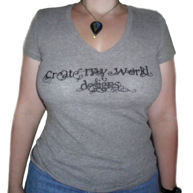
So, I set to work and created a T-shirt painted with my business logo. The front was bedecked with the chosen font of my business name logo, and on the back of the T-shirt, I tried my best to simplify and capture (in painted polymer) my polymer quilled globe design (which has become my business logo - see the header of the blog above), plus the text of the web address of this blog.


Unfortunately, time was running low and when it was time to paint the inside of the continents (the very last thing I did), I was left with the choice of letting them go unpainted, or painting them with a combination of straight liquid polymer from 2 different brands. As I had predicted, the result of the straight LPC, without my secret additives, was a stiff texture. Luckily, these are such small areas, that it will not detract from the comfort of the T-shirt. Unfortunately too, I was unable to add the scrolled faux quilled design to the interior of the continents, due to lack of time.


All-in-all, I'm happy with the results of my experimentation and my new walking advertisement for my business! As I alluded, I am wanting to experiment further with this idea, and have a stack of T-shirts piled up, waiting to be decorated. When I get the combination adjusted to a well workable, curable and predictable mixture, I'll be ready to share my experimentation and results, possibly in the form of a tutorial. Thanks for stopping by my blog to check out my logo T-shirt project! I'd love to hear your thoughts on this piece, please consider leaving me a comment below! Voting opens for this PCAGOE challenge on September 1st and will run through the 7th at midnight EST. I'll try to post a reminder here, when voting is open.

Thursday, August 6, 2015

Voting Reminder

Only 2 days left to vote for the PCAGOE challenge. Remember you could win a prize, just for taking a minute to choose your 3 favorite entries! This month has amazing pieces to interpret the theme of Fairy house, take a peek:


Voting is open until tomorrow (August 7th) at midnight EST. So, head on over to the PCAGOE website to cast your vote!

Saturday, July 25, 2015

She sells seashells...

...down by the seashore.

Perhaps I've been daydreaming about a trip to the beach far too often this summer. When the time came to construct a fairy house for my (PCAGOE) guild's August challenge, I automatically began thinking about a fairy who lived at the beach. As a child, I was fortunate to have parents who would take us to the beach nearly every summer. As an adult, it hasn't been as easy to get to the beach every summer; in fact, it's been many years since I've felt the sand between my toes and the sea salt in my hair. I guess that's why every project I've done in the last couple months has had a beach/summer color palette. The ocean is calling me, and this is presently my only outlet.


It all began with a shell... at the start of this project, I had decided that my fairy would set up house in a whelk shell she had found on the beach. Well, after I created my little whelk shell, I loved it so much that I didn't have the heart to bury half of it in polymer sand, nor did I want to add a door or cut a hole in it for adding a window. I wasn't completely sold on this idea in the first place, so I gave the theme some more thought.


Above: Shell (before adding orange color and gloss to interior)
Below: finished shell


I considered abandoning the beach theme and doing a woodland fairy house. But I persevered and inspiration struck when I was brainstorming things one might find at a beach. I had wanted to incorporate polymer sea glass, because I adore sea glass. I came up with the idea of a sea worn bottle fully intact, yet partially covered with coral calcification and tiny seashells. This would be a fairy's lighthouse! Can you just imagine her magical light illuminating the inside of the bottle? The cap of the bottle can be removed, so one can insert a glow stick or small battery powered light to illuminate the bottle.


I decided that I would use the faux glass effect tutorial, by Ginger Davis Allman of The Blue Bottle Tree, to create the sea glass pebbles that would be the stepping stones to the door of the light house, and also to cover portions of the bottle that would become the lighthouse. I was so pleased with the effect of the faux sea glass. Ginger's tutorial is so well written and illustrated that it's perfect for all levels of experience, beginner through advanced; so if you love the look of sea glass, I highly recommend buying the tutorial. I wanted to incorporate tiny seashells encrusted in the coral on the bottle, and I wanted all pieces to be made from polymer, so I set to work and created some tiny horn, whelk, olive, scallop, oyster and snail shells. I used a white and translucent Premo mix and hand sculpted each shell, sometimes adding inks before sculpting, sometimes after sculpting. I was fairly pleased with my little handmade shells. You can catch sight of those tiny shells here:


The door was to be made of faux driftwood with the smallest of snail shells as a door knob. To create the door I used Premo Rhino colored clay which I sculpted in layers to give the look of water worn wood. After curing the door was antiqued with burnt umber water based oil paint, to bring out the details:


The faux coral was created with various items to give texture and indentations. I used a blend of Premo white and translucent, with some inclusions (scrap clay left over from a previous project). After curing, I gave a gentle antiquing to the coral parts by sparingly brushing the burnt umber water based oil and immediately rubbing with a wet cloth to give only the faintest color.


For a final touch I decided to create one more beach item (a starfish) and a sandy pedestal for my little fairy lighthouse ensemble. The starfish was created with a blend of Premo white and translucent,  it was hand sculpted, given color with inks of yellow and orange and given a treatment of texture using a firm brush.

The sandy pedestal was created with a blend of Premo white, translucent and rhino, which wasn't completely blended together to create a solid color, some streaks were left behind to give the feel of beach sand's varying colors. I gave a light dusting of the entire sand pedestal with macro pearl Pearl-ex powder (not easy to see in the photos), to mimic the shine of mica in the sand. I textured the faux sand with a crumpled up ball of tin foil, and indented areas for where the lighthouse should be placed, as well as indentations for where the sea glass stepping stones and whelk shell would be placed. All items of this little set are moveable for flexibility in decoration.


I am really pleased with my little fairy light house, and still in love with the idea of a beach fairy! But, this little piece is not something I need to keep for myself. The large whelk shell does beg me to keep it because it sculpted so easily and (I think) turned out so well), but I don't really want to break up the set. So, I believe this entire little set will find itself available for adoption in my createmyworld etsy shop within the next week or so... 


What do you think of my little fairy house? Please leave me a comment and tell me your thoughts! Voting for this challenge opens on August 1st (how can it be almost August already?!?). I will try to post a reminder here when the challenge is open for voting! Thanks for stopping by to check out my little fairy light house, and please consider leaving me a comment! :)

Saturday, July 18, 2015

A Polymer Cover-up

I'm posting about a project that was completely independent, i.e. not driven by a guild challenge! ;) Don't get me wrong, I love my guild challenges, but I never seem to post about other projects here. This one happened because I have this coral/salmon colored t-shirt that acquired some bleach spots at the bottom. I love the cut and fit of this t-shirt and really didn't want to retire it to the household chore wardrobe. So, I decided to cover up the spots, with polymer!


I sketched out a basic radial design in washable fabric pen, then I set to work attaching small circle and oval cut outs of polymer in shades of blue and white (yep, still in that orange/blue phase that I've been in for the last 2 months...) ;) The blue and white clays were rolled out to a thin gauge (#4 on my Imperia pasta machine, which has a range of 6 different thicknesses, #1 being thickest and #6 being thinnest). I used a tiny round kemper cutter to cut the round circles, and I used the empty ferrule of an old paintbrush that lost it's bristles to make the tiny oval slivers. I kept the cut pieces small to eliminate cumbersome feeling within the shirt and keep the fabric movable. I attached each cut shape by applying bake n bond to the backside of the polymer pieces. I worked in segments of about 6" by 8", curing in between segments to keep the areas for curing totally flat in the oven. 
Here's a shot of the shirt before the applied polymer, you can see the bleach spots (lower center and right) that I was trying to mask:


So, next time (and I do plan to do more of these), I will use a thinner setting on the pasta machine for my polymer sheeting, probably #5. While the #4 guage worked okay here, it did add a bit of weight to the shirt. I also think that a thinner setting will make for a sturdier design. You might ask, is it machine washable? I tested that, this shirt has gone through the wash on a normal cycle and survived, only one of the polymer pieces came off (as you can see in the front view below). This I consider a success, and I will be replacing the piece that came off. If you decide to try this for yourself, please consider washing your finished garment (in cold water only) with small loads of laundry or, choose delicate cycle or hand wash to avoid causing any missing pieces... and always air dry (heat from the dryer could effect the polymer).


The design wraps around the side and also spreads across the back. Here's the flat back view:


And the flattened side view:


I had so much fun making this, I love that I saved a favorite shirt, and I love how it turned out! I can hardly wait to jazz up another piece of clothing! I can also see this idea put into use to cover up unwanted holes in clothing.... lots of ideas running around in my head! So, until my next project posting, leave me a comment and tell me what you think about my polymer bedecked T-shirt... Thanks!


UPDATE 7/19/15: I just reattached the one piece that went missing after machine washing, and I removed and replaced the one circle that (for whatever reason) got a little darker than the rest.  It must have been touching the side of the oven at one point and got a bit scorched. Let me tell you, removing that little circle was tough! I couldn't believe how fast it was attached... and it ended up tearing into the blue clay and leaving a bit of the blue behind... I was thinking it would just pop off with a little pressure, but it did not! So, now I'm even more certain about the strength of these little pieces attached to the shirt. 


I'm so happy to report that this project was shared on Polymer Clay Daily!! Here's the link:


Tuesday, July 7, 2015

Last Minute Reminder!

I nearly forgot to post a reminder about voting for the July Texture Plate Challenge! If you missed my post about my entry, you can find it here. Just look at all the wonderful pieces created by my guild mates for this event:


As usual, I had a tough time choosing my 3 favorites because of the many wonderful interpretations on the theme. Please take a moment and choose your 3 favorite entries, then cast your vote at our website. Don't delay, voting ends tonight (7-7-2015) at midnight EST! Remember, you could win a prize, just for voting!!

Thursday, June 25, 2015

Polymer Art Printing

Texture plates is the theme for the PCAGOE July challenge. The idea is that each participating member would create a texture plate from polymer and then use the handmade texture plate to emboss raw polymer; then, create something with the textured clay impression. As I mulled over ideas for this project, I recalled the many mono prints that I created in a printmaking class that I took in college, and I thought it would be great to have a handmade printing plate to create a run of original polymer printed artwork! I would make wall art using the texture plate as my printing plate, but could make each one look unique by changing which media and colors I applied to the plate. 
Below is a photo of my first 3 polymer art prints with the original texture plate (solid blue at bottom)

My first efforts at my texture plate design were a total failure. I had the "brilliant" idea to combine paper strips with LPC which, in the end, turned into a big mess. I may revisit this idea again when I have more time to play.

 So, the next phase saw me making impressions in a slab of raw polymer using various tools and cured coiled quilled polymer (to create the spirals you see above). I wanted some areas that would create deeper impressions, so I made sure to add a band of small raised circles on top of the plate. My final result of the textured plate is seen below:


Once the texture plate was fully cured. I conditioned a large amount of white Premo polymer. I then set to work on creating a "print". I painted on the plate with various mica powder colors, in reds, oranges, yellow/golds and blue (I'm still in a blue/orange mood, as I was last month). I mounted the texture plate face down on the raw white polymer and gave every area lots of pressure, making sure to flip it over and press on both sides, to get a good impression. The result was this lovely print (my favorite of the 3):

After it was released from the texture plate, I did add a few spritzes of red/orange ink, which I smudged with a paper towel all over the surface, I did this to make the orange coloring more prominent and darker. After curing, this was mounted to a black frame.

For the second print, I decided to use blue Kato liquid polymer to paint the entire texture plate. I impressed into the clay as before and released the plate from the print. I fully cured the print, then I added some areas of orange Kato liquid polymer to accent the blue printed areas, and I fully cured that layer. The final result is this polymer print, also mounted to a black frame:


For the third print, I wanted to use alcohol inks, but before wasting ink tried first with just plain rubbing alcohol. This didn't work as well, the raw polymer was sticking in the fine spaces of the texture plate and did not release as easily as the other 2 methods. So, I decided to paint the entire texture plate with a white mica, to allow for easy release of the print. After the all-white polymer print was released from the texture plate, I then added alcohol inks to the embossed raw clay. (So, this one really isn't a print... I'd call it a painting because the colors were added after the texture was embossed. The previous two pieces, however, are true prints, as the color was added to the plate and transferred onto the raw polymer.) To paint this last one, I first painted everything with varying shades of blue alcohol ink, then I used some spritzers of white and orange to add interest. This one too is mounted on a black frame:


I was having so much fun with this, and wanted to try some other alcohol ink painting ideas, I just didn't want to stop creating... so I made the pendants for this necklace and earring set:


I was really pleased with the effects I achieved! This will be a tough necklace for me to part with, because I love it so much... but I think it might end up in the createmyworld etsy shop because it has matching earrings (I rarely ever wear earrings). Here are a few more shots of the jewelry:


Oh, and here's the backside of the jewelry:


I really had so much fun making this project, and I see my self exploring this idea further by creating more texture plates!


I am really so pleased with how these turned out! And when my hubby saw the prints, he said "Those are the coolest things you've ever made! Wanna hang them up in the living room?" That is a HUGE compliment! ;) I was going to put them in my createmyworld etsy shop, but I do believe the hubby will claim them for our house. I hope to make more to put on etsy.


Voting for this challenge will open on July 1st and will close at midnight on the 7th. I'll try to remember to post a reminder about the voting... I've not been good about that in the past couple months, but I do hope to be more organized this month!